Wild Out West: New Venture
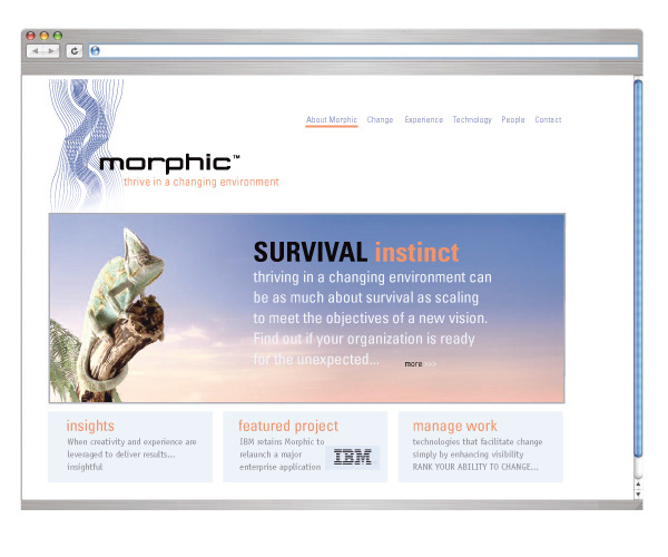
The Chameleon was chosen as iconic for way it adapts to its environment. You can see it on the website homepage... it's eyes follow the cursor and watch as the animations change on the page.
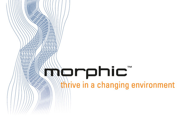
Morphic was formed in 2005. We re-named the company, originally founded as The Zocher Corporation, the company's management team wanted a strong identity to move from DOE consulting to larger commercial project management applications. WOW delivered a name, acquired the top level domain www.morphic.com and created an international trademark. The name and positioning have a clarity of message and integrity with the value that this company delivers - They help their clients to manage change.
Morphic has developed some powerful new project management tools that deliver the ability to manage change through visibility, inter-relational data and clear, highly usable interfaces.
The waves of lines represent the analysis of change -with the name Morphic pushing the lines around.
Morphic is another example of the successful integration of BRAND VALUE to every point of contact.
Morphic is another example of the successful integration of BRAND VALUE to every point of contact.

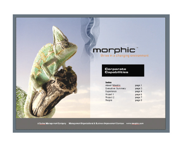
CORPORATE IDENTITY: The image hardly does the production values justice. Blue metallic ink and all the other colors are engraved for rich color and texture.
POWERPOINT This company uses presentations made in person as a key platform for credibility, and every proposal includes information that clearly differentiates Morphic from other firms and gives clear reasons for working with the firm.

BRAND AS GIFTS AND UNIFORM: This company is active -and the brand image extends to the people who run it. Not to say you don’t see the occasional shirt and tie, but there is an ethos and a culture that is supported by the brand.