MoonExpress is a private company that will be making big news shortly, as they deliver their first robotic landers to the moon. They have a partnership with NASA and are the leading contenders for the Google xPrize.
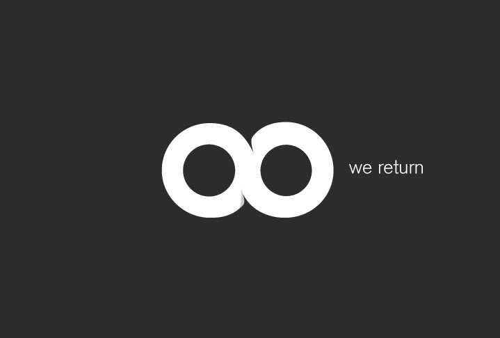
The brand icon is also a part of the double o's in the wordmark. The essence of the company is that the lander is designed for multiple missions. It returns and follows an infinite route between the Moon and the Earth. Also, the company is engaged in mining rare earth elements on the moon, which we have defined as the Eighth Continent.
The symbol incorporates all of these ideas - Infinity, the eighth continent and the double o's in a simple, memorable icon that engages the brand story.
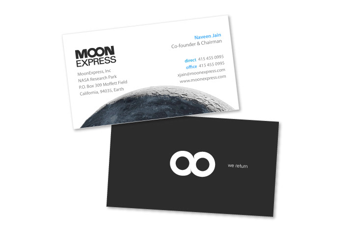
Simple business cards use a rich matte black
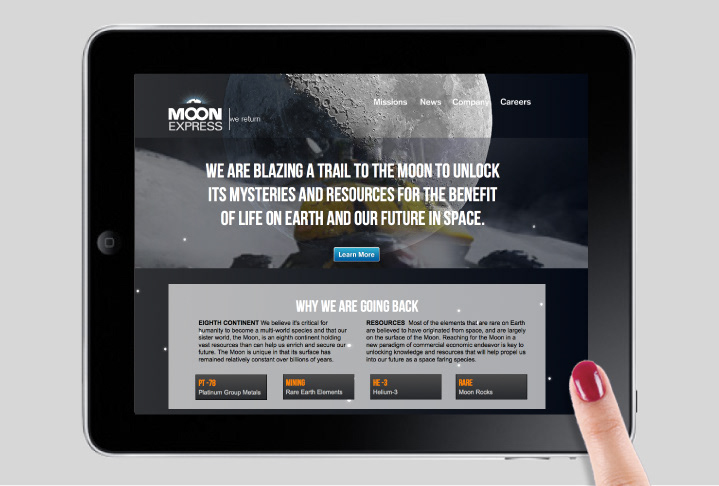
Parallax scrolling site where elements are coded to animate at different rates and even move in different directions. You can visit the site at www.moonexpress.com
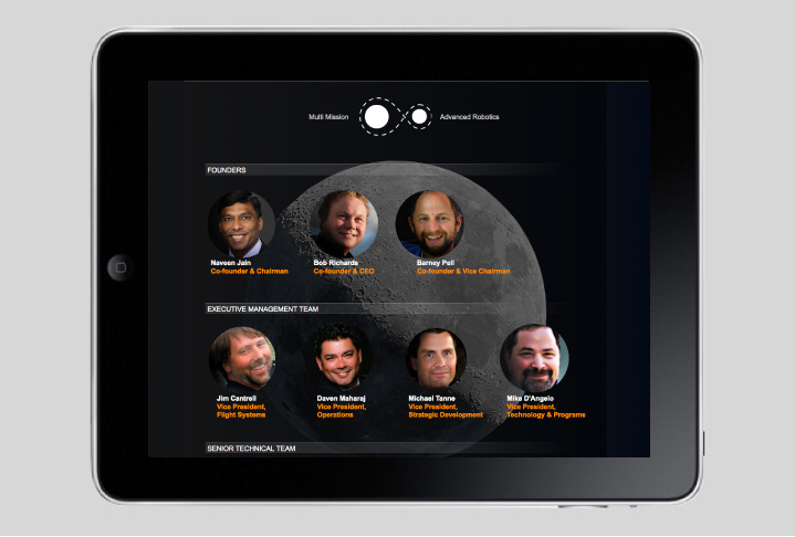
Bios and interviews pop up with mouse-overs or taps
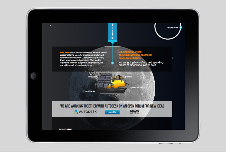
The lander is detailed and animates into its phases
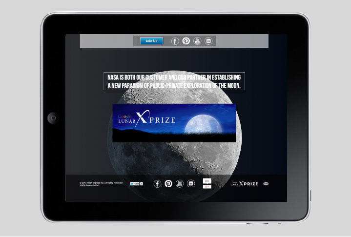
Simple use of Social Media links as integrations vs. simple inks
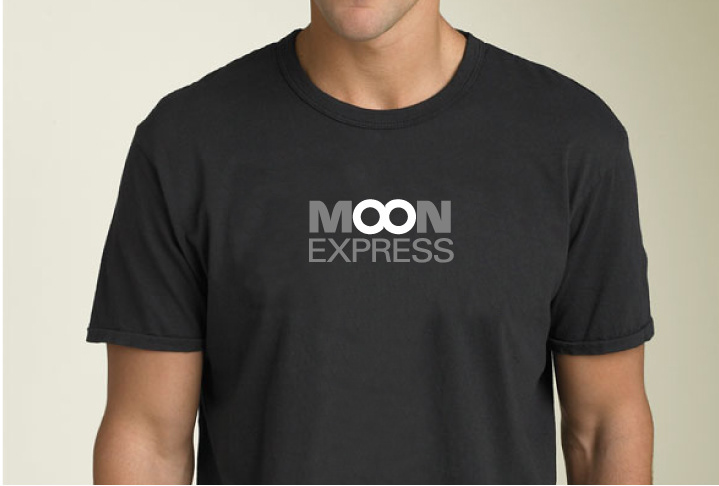
MoonExpress shirt is at once, the name of the company, an infinite loop and a symbol for the eigth continent
Video introduces the company, team and vision.
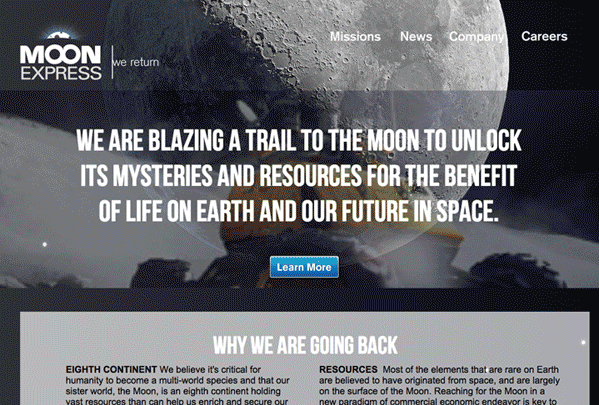
Its very difficult to show the parallax scrolling with an animated GIF... go see the website: www.moonexpress.com
We also have some interesting expreiments in JavaSCRIPT ANIMATION ON OUR SITE AT WWW.WILDOUTWEST.COM